The annual Street of Dreams home show in Portland is an event I always look forward to with anticipation! What fun to stroll through homes, seeing a wide range of architectural features, finishes and decorating ideas! It's my Nirvana.
While home shows have struggled to stay viable within a turbulent housing market, the local response this year was to showcase a collection of smaller homes with more realistic prices, all in the $800,000 to 900,000 range. And though these homes still aren't affordable to the average home buyer, they are certainly closer than the homes in the past with price tags in the millions.
While home shows have struggled to stay viable within a turbulent housing market, the local response this year was to showcase a collection of smaller homes with more realistic prices, all in the $800,000 to 900,000 range. And though these homes still aren't affordable to the average home buyer, they are certainly closer than the homes in the past with price tags in the millions.
HOUSE ONE

Frank Lloyd Wright inspired architecture was the highlight of this home, and it is a style that looks very much at home in the NW with it's emphasis on materials of wood and stone.
Each home featured covered outdoor spaces with fireplaces...a dream for our own backyard. With rainy weather much of the year, covered outdoor areas make it possible to enjoy being outside beyond the summer months.
The highlight of this house was the built in closet with quality cabinetry and substantial shelving...
...the flooring and bar stools...
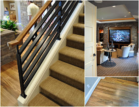
...and the masculine elements in the banister, entertainment wall and carpet.
With the new economy there was considerably less emphasis on decorating the homes to the level seen in
previous years, which was disappointing. But I loved this felt flower poof {DIY project anyone?} and stainless steel dresser!
HOUSE TWO
I always find myself drawn to Tudor style exteriors.
And while my family tends to dash out of view whenever I pull out the camera these days, on this evening they strangely made no effort. So please, no complaints about being on my blog today....
This home had the best outdoor space, well dressed with a peeks of the view beyond.
There was a nursery with high ceilings and unusual architectural details, which were sadly not taken advantage of in its decor. A Juliette balcony was the focal point in a girls room, with stunning views from the master.
This was the best decor idea I saw in the entire show. A lattice cutout creating a whimsical and striking backdrop behind the bed in another girl's bedroom.
The tile and the wood flooring in a similar tone were fantastic!
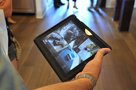
Technology was the star of this home, creating a "smart house", with all its functions able to be controlled from an iPad! It would be interesting to see how this would change how you lived in the home.
As we were leaving through the garage I was puzzled to see this really fun piece of furniture sitting forgotten in a corner. Surely a place could have been found for it somewhere within the home!
HOUSE THREE
Home number three was the least impressive or interesting from the exterior, but it had the best kitchen of all the homes.
Right up my {design} alley, I loved the modern touch brought in by the zebra wood island.
A back hallway and stairwell featured a built in seat and a set of message boards. Another great DIY project. Anyone up for creating two side by side boards, one magnetic and the other chalk? This hall lead to the second outstanding room in this home, a flex space with floor to ceiling windows and access to the backyard.
If this were my home I'd be claiming it as my home office!
HOUSE FOUR
This home was the Paula Deen home, featuring her new line of home furnishing.
And look, she was on site to welcome us!
While a little overdone for my personal taste, it had a very warm and homey feel, with very well appointed interior and exterior kitchens. Well, it is Paula's home after all!
The built-in cabinetry in the dining room...
...bathroom...
...and nook in the master entrance, as well as the mudroom, was the outstanding feature in house number four.
HOUSE FIVE
I somehow missed snapping an exterior shot of house five, but I was very excited by its potential upon seeing its gorgeous dining room and how beautifully it was decorated and furnished!
The outdoors had a fun and somewhat strange exercise area that I could barely pull the "kids" away from...
...which gave me time to spot a SOLD sign on the plants in the backyard. Odd to see the plants have sold while the house hasn't, I wonder why.
The answer to that question was provided upon entering the kitchen. I'm speechless.
{Rather, I became speechless when my husband suggested I be less vocal with my opinion while touring the space.}
This finish. Why?
I wasn't the only one looking for an answer.
The "why" only grew as I saw the cabinetry finish continued through the media room, family room, laundry room, and all the bathrooms.
But regardless of this strange conclusion to the show, what a fun way to spend an evening!!


beautiful homes but the last finsih! EEEEEWWWWWW...that's all I got! =)
ReplyDeleteLooking at all the houses -I love the indoor-outdoor area, the built-in bench, the "home office" is absolutely beautiful and touches like the latticework wall, Beatles backrest, and so on.. but yes, the last house - good question, "why?"
ReplyDeleteA thrill to see these Portland homes. The price difference from years past is indeed different. I use to attend the Tour of Homes on Seattle's East-Side often and it was always good fun. The finishes were beautiful until the last kitchen, just like you said; I thought my eyes were burning!The worst I've seen in a long time. What a gorgeous day for the whole family to have some fun. Enjoy these last sunny days of summer with your great family!
ReplyDeleteThat lattice work headboard-headboard is beautiful!
ReplyDeleteAnd that final kitchen---too funny. It looks like a 2-D set, painted to seem 3-D.
Definitely going for accessible design on this tour! Saw west elm and cb2 accessories and that great pouf is really reasonable at Modern Dose, an online store. The first house was very pacific northwest -- mbwife
ReplyDeleteThat last kitchen--wow. Who in their right mind??? Maybe there was a sale somewhere. The finish on the dining room table is sweet though. We'll give 'em points for that one;)
ReplyDeleteThe finish is ghastly!! It looks cartoonish. Oh my my my.
ReplyDeleteOh my goodness, that finish looks spooky.....like the set of a horror movie.Thanks for great pics!
ReplyDeleteCoffin. The first word to enter my mind upon viewing those ghastly cabinets at the end.
ReplyDeleteI have to laugh... in many a situation, I've been reminded (by the hubby) at how my voice carries, particularly when exalting my opinion on something quite unappealing! You quite simply cannot hold back gasps as a woman :)
OMGosh...that kitchen!! I have never seen such a massive fail in a show home!! Wow is all I have to say.
ReplyDeleteThank you for posting so many photos of the Street of Dreams. I live in Southern Oregon, so I read about it in the paper, and would have loved to attend, but the drive was just too much. You can imagine I was thrilled when I saw this post!
ReplyDeleteWhere can I find drum shade light over table in house #5
ReplyDeleteWhere can I find drum shade light over table in house #5
ReplyDelete