Friday, September 30, 2011

{Super} Busy Working On...


It's one month until the release of the next issue of House of Fifty

While that may seem like a long time away for you, it'll be here before I can blink and we are super busy pulling the last pieces together.

Here's a little preview of what is to come: a feature on the work of one VERY talented photographer and the story behind some of her absolute favorite shots. We can't wait to share!

Wednesday, September 28, 2011

Seriously? I Would Have Never Seen This Potential!


Adri and Jeremy of Dream Book Design have been one busy couple, turning their fixer into a keeper!
And this project of theirs is insanely fabulous.

"A couple of months ago J bought this massive card catalog from Craigslist. It is from a closed down old Phoenix Public Library. It was so incredible, but yet we had no idea what the heck to do with it. It sat in the garage for a good four months until one day my hubby had a "light bulb" moment and decided he would take it apart and transform it into the most beautiful buffet ever...really, ever!

This is what we started with..."


And this is what they did:

1. All 72 drawers were removed and numbered with tape {so each could find its way back home later!}
2. The outside plywood casing of the original cabinet was also removed.
3. Next the four sections of 18 slots that were stacked 4x1 were taken apart from one another and reattached side by side.


4. Then two 4'x8' sections of oak plywood, cut to size at Lowe's, became the new top and base. The original casings were used for the sides to preserve the character of the piece.


5. Eight legs from Lowe's were attached to the base sheet of plywood in a diamond pattern to support the weight of the card catalog.
6. 3/4" trim was used to edge the new base.


7. Everything was sanded, re-sanded, and sanded some more to really smooth things out.
8. All 72 drawers were painted with Primer-in-One from Home Depot and Behr Premium Plus Ultra paint in Rhino.
9. Stain, Minwax Dark Walnut 2716, was then rubbed all over with a small brush and a few rags to give the antique look, followed by a little more sanding and then a layer Minwax wipe on polyurethane to seal it.
10. Finally, the original hardware was reattached to each drawer.


I'm exhausted just thinking about this project...but completely and utterly impressed!
If you haven't been by their blog, here's the link to do so.

{Thanks Adri for letting me share your project on my blog today!}

Monday, September 26, 2011

I'd Take Any One Of These!

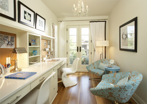
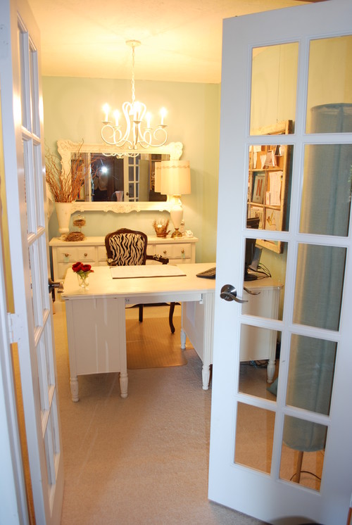
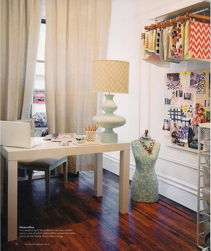
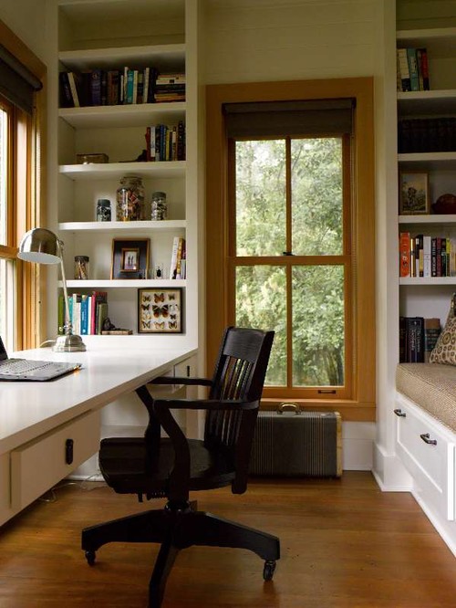
I'm in the midst of pulling our bonus room together with a bit more style and function, claiming a corner of the room as an office space. It's the "real estate" that is available to me in the house, but if I had an entire room, here are some spaces I'd love to consider emulating!

Tiffany Blue Girls Lounge eclectic home office

Martha O'Hara Interiors

Seriously, how chic is this! I adore the long desk top running the length of the room, the damask chairs and french doors at the end of the room.

NEST Home Office eclectic home office

Judith Balis

More french doors and fanciful fittings. 

Home office inspiration contemporary home office

image from Houzz

The wall of drapes dividing off the space, the oversized lamp and all those fabric samples; I'd love to know what this person does!

Writers Hut traditional home office

Bosworth Hoedemaker

All tailored and buttoned up, I can imagine sitting at this desk facing a window and being very content and productive.

Home office inspiration contemporary home office

image from Houzz

Another space that causes me to wonder what the occupant of this rooms does, it must be pretty fabulous.

New American Home Office contemporary home office

LDa Architecture & Interiors

And one last space, a small enclave that maximizes functionality while being pretty spectacular with all the built-in storage and cabinetry, capped off with a striking gun metal gray sliding door.  

Do you have a home office? What is your favorite thing about it?

Friday, September 23, 2011

If You Missed Out Or Were Disappointed...

If you missed out or were disappointed with the Missoni offerings at Target, consider splurging for the real deal!

{Missoni Scarves at Anthropologie}

I was given a Missoni scarf ten years ago, wear it constantly for a dash of color and pattern, and the scarf looks as fabulous as the day I received it! Sometimes it does pay to go for the "real" deal.

10 Kid's Bedrooms That Prove Good Design Isn't Just For Grownups!

TLC's site Parentables just posted an article showcasing some wonderful kid's bedrooms, and I'm flattered they asked if they could include Max's bedroom in the lineup! Here is what they said about designing rooms for kids:

"Most parents know that children's tastes change as quickly as they grow, but that doesn't mean that you can't create a space that they are sure to love for many years to come and that you'll be happy to have grace your home. These stunning kids' rooms prove that kids' rooms can be both fun and chic."

Ha!! If you read this post on Isabella & Max Rooms this week, you know I know about rapidly changing tastes! But that is another story...enjoy these rooms!


"We love how the designers make an all white room so exciting by adding pops of color with turquoise and chartreuse in unexpected places such as behind the bookshelves as well as in a few standout pieces such as the headboard, throw blanket, and pouf/ottoman. The built-in cabinets and desk make it clear that this room was truly a custom design, but the pops of color against white make it a great inspiration room for both those who have free reign over their homes and those who are renting and may not be able to change wall colors."


"In addition to being timelessly chic, this twin gray and yellow boys room designed by Janell Beals of Isabella & Max Rooms encourages its inhabitant to dream of things beyond the four walls that surround him. The parts of the globe painted on the walls combined with the large stripe of chalkboard paint allow him to dream of his next destination and plot his route to get there, and we love how Beals incorporates every surface of the room into the design by adding a compass surround to the hanging pendant on the ceiling." (ah shucks, thanks!)


"While this room designed by Serena & Lily would easily be suitable for a little girl moving into a big girl bed, we are certain that said little girl would also be asking to take most of these pieces with her when she moves into her first apartment in the city. The pieces are clearly inspired from various locales around the world and easily translate from a comfortable and sweet child's room to an eclectic, worldly, and chic home."


"The vintage inspired pieces in this room by Restoration Hardware Baby & Child are sure to last for many years, if not generations, to come. We particularly love the Millbrook bed against the backdrop of the vintage flag and the oversized toy bin as you can never have too much toy storage. This room is sure to inspire your little to both appreciate the designs of generations past as well as understand the importance of history."


"Holly Marsh from the blog Life as a Thrifter took inspiration from her prior career as a kindergarten teacher when designing her daughter's room. Marsh perfectly mixed old and new in using modern pieces with clean lines from Ikea for the crib and book shelves and combining them with vintage style wire baskets, an old schoolhouse chalkboard, and oversized letters in a hodge podge of colors to spell out the alphabet. The combination of fun colors and "old school" charm are sure to put a smile on anyone's face as the walk through the door."


"This little boys' room evokes the feelings of a well loved teddy bear. Grace Sorensen of the blog Grace Happens used a mix of checks and stripes along with vintage and new items to carefully display items that all have one thing in common: a special meaning to her and her son. This room is a perfect example of showing that things can be very beautiful when paired together even when they aren't matchy-matchy."


"This stunning little girls room designed by Palmer Weiss Interior Design is certain to make any child feel like she is living in a fairy tale. We love the use of a sophisticated fabric in formal draperies, canopy, and bedskirt offset by the fun striped rug and cheerful butterfly accent pillow. The combination keeps the formal feel of the home while also making it clear that it's a kid friendly space."


"The only thing better than one stunningly beautiful bedroom is two. Kathleen DiPaolo of Pacific Family Homes designed these two rooms using the same elements with different accents for a set of twin girls."


I have to say, I'm pretty taken with these last rooms with the combination of blue grasscloth, divine headboards and sparkling light fixtures. I'd enjoy such a room myself!

Wednesday, September 21, 2011

I Just Had To Find Out Where This Came From!

I was at a location that will be featured in an upcoming story in the Holiday issue of House of Fifty and just fell for this tufted ottoman. I inquired where on earth it had been found, and no one could exactly recall.


Well, a little research (well, a lot actually!) upon returning home served up the answer. It's the Maison Tufted Ottoman, over scaled at a grand 58" x 42".


The beauty comes from this shop, and while not inexpensive, was less than I thought it might be at $803.

{Lisa's find in Dubai}

Which reminds me, I saw a very similar one on Lisa's blog several weeks ago. Okay, now it makes sense why I was so excited to see a version in person!  She found hers at Bloomingdales, in Dubai. Of course after seeing hers I went online to Bloomingdales on the off chance. No luck, of course. Lisa recently moved to Dubai and is busy pulling together pieces for her new home there! If you haven't visited her blog, you should.

Wish I had a spot for the ottoman in my house, but can't wait to show you the space I spotted it in. 
Look for the latest issue of House of Fifty, out November 1st.

Monday, September 19, 2011

Did You Ever Wonder Where All That Gorgeous Marble Comes From?

Whenever I thought about where marble comes from, I didn't quite envision this!


Images of a quarry in Carrara Italy.
The vastness is simply amazing, it hardly looks real.


And here it is, ready to be cut into slabs.


And placed in fabulous kitchens...


...and bathrooms.
{Dream kitchens & Bathrooms that is!}


A Steve Giannetti Bathroom.

All images from Cote de Texas via Pinterest

Friday, September 16, 2011

Trend Alert: Short Curtains!

Would you hang short curtains in a room in your home?


Natalie from Natty by Design did, and they add just the right amount of color and fun to her daughter's room!


To see more fantastic rooms in which short curtains are used with success, read "Trend Alert: The Long and Short of It" in the Fall issue of House of Fifty, beginning on page 20. Emily A. Clark writes a fun piece that explains what type of rooms short drapes look best in!

Wednesday, September 14, 2011

The Best of Shari Miller

Aren't I and House of Fifty lucky to have the talent of Shari Miller leading the Art Direction of the magazine?! I stumbled across her work after reading a rave review on a blog that had just gotten a makeover by little blue deer.


So I stopped over to Shari's site and loved what I saw. Next thing I knew I was getting my blog Isabella & Max Rooms redesigned and we were talking about working together on a new venture, House of Fifty!


Let's Decorate Online


She's done some excellent work for a very long list of blogs and sites, while offering up some visual inspiration on her own blog, posting inspiring interiors and other items that have caught her eye.


If you aren't already acquainted, you should be.

Monday, September 12, 2011

11 Area Rug Rules and How to Break Them

{A reader just sent me an email about this Ideabook I recently wrote for Houzz and how it helped her client decide she did indeed need a BIGGER rug for her dining room. I love that, so I thought I'd repost it here! Janell}


I often get asked "What are the rules in selecting the size of rug to use in a room?" It can prove to be hard deciding what size rug is best for a space as there are so many "rules" and just as many opposing opinions.
One popular rule is that the rug should be large enough to slide under the front legs of sofas and chairs in a seating arrangement, unifying the furniture. But just as frequently I've heard it suggested that all legs of the furniture should sit on the rug! So, rather than being bound by rules, being aware of these guidelines and options will assist you in determining what size rug provides the visual effect you desire in the rooms of your house!
traditional family room by Valerie DeRoy Interiors, LLC
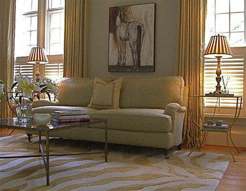
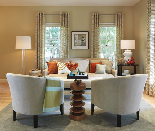
Rule 1: Front legs on the rug, back legs off. Here is a gorgeous room where the front legs sit on the rug while others are off. This approach really does work in most situations; the rug connects the various furniture pieces together while extending far enough into the room to create a sense of good proportion.
by Valerie DeRoy Interiors, LLC  
contemporary living room by Chelsea Atelier Architect, PC
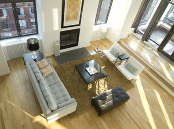
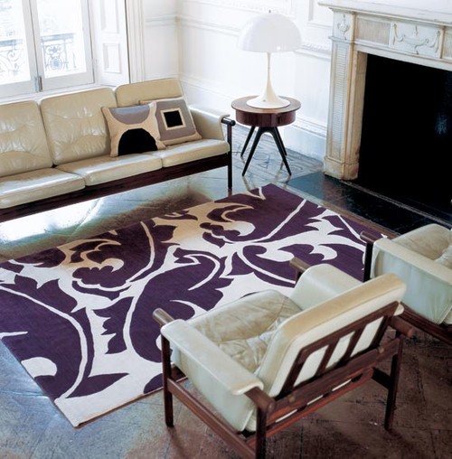
Another example of following this rule, seen from above, shows its effect very well. It works well here in large part because the tone of the rug is very similar to the wood flooring, making the break between the two visually subtle.
by Chelsea Atelier Architect, PC
contemporary living room by Garrison Hullinger Interior Design Inc.
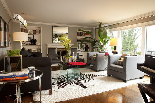
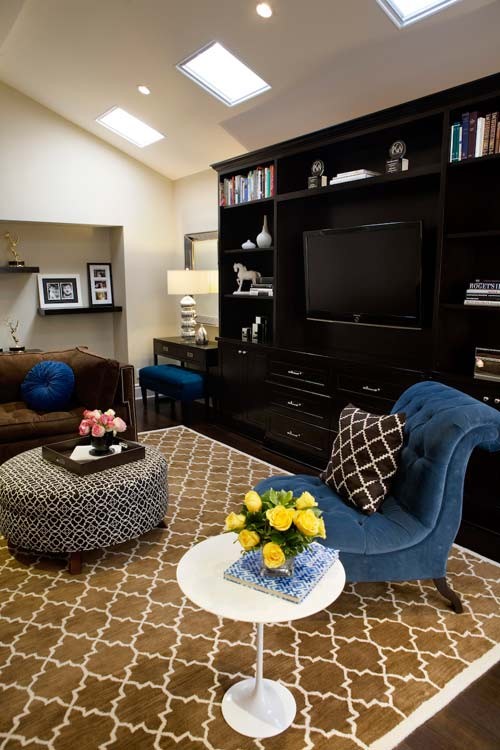
Rule 2: Some front legs on. Before moving onto examples where all the legs are placed on the rug, let's look at a hybrid of the two approaches. Here only the front legs of the sofa sit on the rug while the placement of the chairs leave all four legs firmly on the rug. This proves to be more effective here than if only the front legs of the chairs fit onto the rug, because of the size of the room and the contrasting tone of the rug against the flooring.
by Garrison Hullinger Interior Design Inc.
modern living room by Rachel Reider Interiors
Rule 3: All legs on the rug. One tip is to determine the furniture placement prior to selecting what size rug to use, which leads to the next rule: A room generally looks more pulled together if all the furniture legs are planted firmly on the rug.
by Rachel Reider Interiors  
living room by Vanessa De Vargas
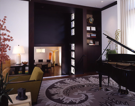
Here is a beautiful example of a large graphic rug defining a space and shows the effectiveness of having all the furniture legs placed on the rug.
by Vanessa De Vargas  
contemporary living room by therugcompany.info
Rule 4: No legs on the rug. Now if you would like to bring in just a small rug, perhaps one that introduces a pop of pattern into the room, another approach would be to have none of the furniture touching the rug. While this creates a completely different look, it also works!
by therugcompany.info
contemporary living room by RYAN ASSOCIATES GENERAL CONTRACTORS
Rule 5: 18 inches of bare floor around the rug. The next rule has been a standard for ages, and this approach states that there should be approximately 18 inches of bare floor between the rug edge and the perimeter walls of the room, bringing in traditional proportion. This guideline is great in rooms that are enclosed and separate from surrounding rooms, as opposed to open concept spaces.
by RYAN ASSOCIATES GENERAL CONTRACTORS
traditional closet by Abbott Moon
Using this rule in a small room is more successful if the 18 inches of bare floor exposed around the rug is reduced to approximately eight inches.
by Abbott Moon  
contemporary home office by Ventana Construction LLC
Rule 6: Just a few inches of floor around the rug. Here is a successful application of the rule to run the rug up to within inches of the wall around the entire room. While a traditional approach, it feels modern here due to the decor decisions.
by Ventana Construction LLC  
modern bedroom by Amy Lau Design
Here is another wonderful example of this approach and how the rug defines the room design.
by Amy Lau Design  
modern bedroom by Amy Lau Design
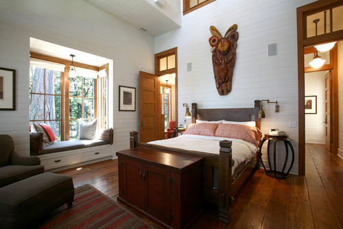
Rule 7: Extend the rug 12-18 inches around a bed. For an area rug to look balanced under a bed, it should be large enough to extend beyond the sides of the bed at least 18 inches for a king or queen bed and at least 12 inches for a full or twin bed. Depending upon the size of the room there can be more rug extension around the bed, but not less, which would make the rug look insignificant being covered mostly by the bed.
by Amy Lau Design
traditional bedroom by Bosworth Hoedemaker
However, a smaller rug can also be very effective placed at the foot of a bed, bringing in just a little layer of interest and pattern. Here the rug width should extend beyond the width of the bed to feel balanced.
by Bosworth Hoedemaker
traditional dining room by Frederick + Frederick Architects
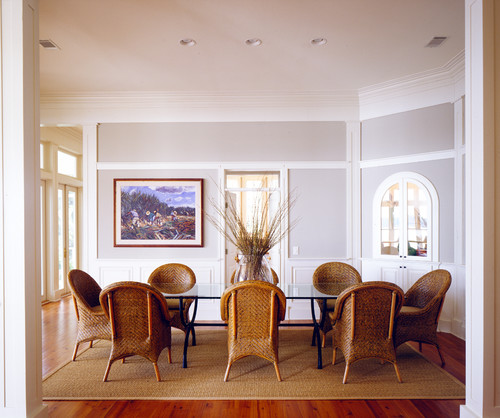
Rule 8: Extend the rug 24 inches around a table. It is much easier to maneuver dining chairs if there is at least 24 inches of rug extending from the edge of the table on all sides. This rule allows the back legs of the chairs to be on the rug, even when being used. This can be a hard design goal to achieve due to the typical proportion of tables to area rugs.
by Frederick + Frederick Architects
traditional hall by Gast Architects
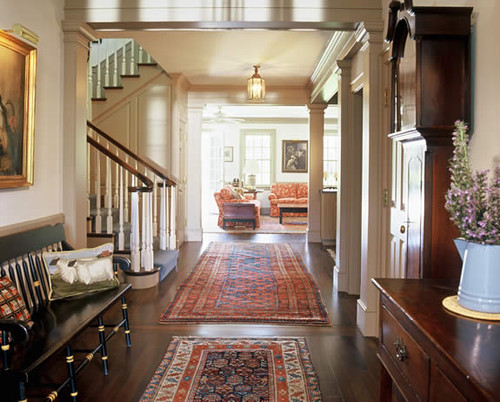
Rule 9: Cover the walking area. The rug should cover the majority of the walking area in a hallway or entry. For both safety and comfort, it is preferable to have both feet fall within the surface of the rug in a high traffic area.
by Gast Architects
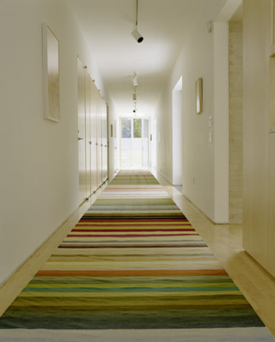
modern hall by Hanrahan Meyers Architects
This hall is a beautiful example of the previous guideline.
by Hanrahan Meyers Architects
modern living room by Tara Seawright
Rule 10: Combine rugs. In making rug decisions for a room, another approach would be to bring in multiple area rugs. This can be very effective when the room is large with more than one seating arrangement.
by Tara Seawright
eclectic living room by Riehl Designs, Inc.
Rule 11: Bend the rules. While all these rules have merit, apparently this room believes the rule of all legs on or off is meant to broken, and doesn't it look great!
by Riehl Designs, Inc.
living room by Elizabeth Dinkel
To sum up this topic, there are multiple rules to guide the decision of what size rug is best for the rooms of a home and many of them completely contradict one another! But being aware of the various rules can provide guidelines to help determine which approach is most appealing to you and will be effective in achieving the look you desire in your individual spaces.